
3.9 Wine Labels
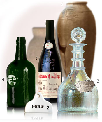 |
| Although the above items appear quite different, they are in fact all wine labels from various historical periods, as follows: 1. An ancient Egyptian Wine Jar with its contents inscribed; 2. A coat hanger "bin label" from the 18th C. 3. A silver 'bottle ticket' hung around a decanter from the late 18th C. 4. An embossed bottle from the 17th C. and 5. A contemporary paper adhesive label, early examples of which did not emerge until the mid to late 19th century. |
Historical Precursors.
After his death in 1352 BC, amongst the astonishing treasures left for King Tutankhamon's journey into the afterlife were thirty six earthen wine jars. Although the contents had dried up centuries ago, these vessels represented an archaeologist's dream come true. Hieratic inscriptions (a simplified cursive hieroglyphic ) not only stated their production date according to the year of the Pharaoh's reign, but the names of the vineyard location, the estate responsible for production, and the chief vintner. Similar discoveries since, detail the purpose or occasion at which the amphorae were presented ("Wine for offerings" , "Wine for merry-making") also revealing the quality of the wine ("Very good wine", "sweet", "wine for a happy return" and so on).(1)These findings suggest that the ancient Egyptians of the New Kingdom (about 1554 to 1075 BC) anticipated the 1855 French'Appellation Controlee'system by thousands of years and encouraged labeling practices that would satisfy most of today's Australian standards, and exceed those of other countries.(2)
In these artifacts, we recognise the beginning of a labeling tradition which continued in one form or another in ancient Greece, then through Roman times up until the late 18th century.
However, the true precursors to the modern wine label do not emerge until the seventeenth century when large vessels began to be superseded by glass bottles. At first, it was common practice to affix to a bottle an additional blob of glass which was then impressed with the owners seal in much the same way that a hard wax is used to seal a letter. This blob or 'prunt' as it was called, was placed on the shoulder or body of the bottle and was generally about 3 cm in diameter.(3)Bottles such as those belonging to university colleges and taverns might have 'blobs' embossed with coats of arms, personal or commercial crests, symbols identifying the business premises, or initials and names. Handmade bottles were neither cheap nor plentiful in the modern sense, being used largely to convey liquor from the cask to home, so these labels identified the owner in order for the bottle to be reclaimed and reused, rather than indicating the precise contents - doing which would have made the bottle redundant the next time it was filled at any rate. Old bottles with seals add greatly to the value of the bottle and are today avidly collected.
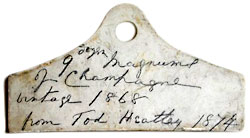
Where previously bottle shapes had been globular and onion-like, a new cylindrical shape gradually emerged after the 1740's. Simultaneously, the use of cork as the first effective long term air-tight closure became widespread. These two factors allowed for the mass storage of bottled wine to be laid flat in 'bins', or large crates, a practice which prevented the corks from drying out, enabling the wine to mature without oxidisation. Bins were identified by coat hanger shaped bin labels, usually made of glazed pottery. By the early nineteenth century many bin labels had part of the face left unglazed, so that more information about the bin's contents could be added. Pictured below on the left is a typical coat-hanger-shaped bin label, but one which has not been fired with a name. The front of the label has contemporary marking in pencil- "9 dozen magnums of Champagne, vintage 1868, from Tom Heatley 1874". Next to it is a pottery bin label with rounded shoulders with the legend 'port', and it has a niche-shaped suspension hole.
 |
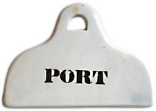 |
| A typical 'coat hanger' style bin label. | A pottery bin label c.1840, this time fired with a title. |
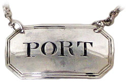
A subsequent variant of the bin label emerged in the mid-eighteenth century, when wealthy wine lovers began to use glass decanters to serve their wines. In order that the servants would know what was in each decanter, labels known as 'bottle tickets' were created. They were usually 'escutcheon' in shape (resembling the backplates of furniture handles) made of ivory, enamel or silver and hung from a belcher chain, such as the sterling silver label pictured below - a typical late 18th century example. Rectangular in outline, it is bowed to fit the shape of a decanter. As well as being engraved 'PORT', it has a pair of reeded engraved lines around the border.(4) There are many variations, but the better and more collectible bottle tickets are typically decorated with a variety of engraved flourishes, commonly a fruiting vine and tendrils. Also produced during this period were neck ring labels and mounted cork labels, which served the same purpose.
 |
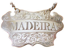 |
| Sterling silver bottle ticket from 1793. | A typical 18th C. escutcheon style silver bottle ticket. |
The paper wine labels we know today have been around since the early 1860's, when an expanding variety of wine styles and the demand for bottled wines began to increase. Mass production was postponed by the search for a suitable glue to satisfactorily adhere paper to glass, and want of printing presses. The important development in this latter field occurred around 1796, when a Bavarian author, Alois Senefelder invented single colour lithography (essentially, a method for printing using a smooth stone, oil and acid then passing over an ink roller), permitting the printing of paper wine labelsen masse. Rectangular label shapes were instantly preferred as they tended to allow room for more information. Meanwhile, Senefelder continued to experiment with multicolor lithography (chromo-lithography), a process later refined in France in 1837 by Godefroy Engelmann.
Early French wine labels are of particular interest, not only due to their continuing influence upon designers, but because they were usually devised and run off by a local printer in what was a one-design-fits-all process, without regard to the winemaker's preferences. Because of this, many designs had a provincial consistency to them dictated by the printer's abilities, market territory, and the designer's taste and sensibilities. Thus, to this day, Bordeaux Red wines tend towards elegant though austere designs with scripted typefaces that frequently feature an engraved picture of the Chateau and vineyard surrounds. Sauternes labels are often printed in warm pale orange/yellows or even entirely in gold. Burgundy uses a faux-parchment effect, usually with Gothic or Bodini script, a style that was also popular with printers down the Rhone and along the Loire rivers. These regional designs have continued, and indeed, it remains a part of their charm. Later regulatory requirements introduced during the middle of the 20th and 21st centuries (such as the French Appellation Controlee system), demanded more detail than mere vintage and content, a requirement which, ironically, has made many European wine labels difficult to decipher.
In Europe, the paper wine label had matured relatively quickly, and its modern day conception as the marketing tool for wine, par excellence, was soon realised in flamboyant and richly coloured designs reflective of the luxury status of the product. The paper label was assured of a permanent and increasingly important place within the culture of wine.
Reading European Wine Labels
The principle difference between New World and European wine labels is that European wine labels tend to emphasize region of origin followed by the estate owner or producer, rather than emphasizing grape variety. In fact, many European wine labels presume that the consumer should know what grape varieties the wine is composed of (amongst other things) by virtue of the appellation information supplied. This often confusing labeling protocol is essentially an extension of the French concept of 'terroir'. Terroir (literally "soil") refers to the complex of factors in a given geographical location that influence and make a wine style unique. These factors include soil type and composition, a vineyard's altitude, angle of incline, water drainage and micro climate, amongst other variables. Probably the best way to familiarise oneself and remember the hundreds of European 'terroirs' and appellations along with their relative grape varieties, is to learn which varieties grow where, using a guide, and, better yet, taste the wines or even visit the regions yourself. This site has introductions to both French Wine Regions and Italian Wine Regions, and these articles offer a good place to start. Whatever you do, there is no quick way.
French Wine Label Terminology
Terms you might expect to see on the labels of French wines which relate to the quality of the wine are as follows:
Quality Wine Produced in a Specific Region. There are two grades of 'QWPSR':
Firstly, Appellation Controlee: Years ago French wine authorities deemed it appropriate that only certain types of grapes grow best in certain types of locations. This gave way to the regulatory system called Appellation d'origine Controlee, or AOC. There are many regulations which must be adhered to in each respective AOC, the most significant being that a wine producer must grow only those grapes allowed in their AOC region to produce AOC wines. AOC is the highest classification that French wine can attain. The requirements vary from region to region. Some regions have the right to the additional qualification superieur, e.g. Bordeaux Superieur, Macon Superieur. That means that these wines have a slightly higher alcohol than the normal appellation.
The second grade of 'QWPSR' is Vin Delimita de Qualite Superieure, which is a designation just below AOC, and is usually a temporary designation for smaller, experimental wine regions that might eventually be granted full AOC status.
There are also two designations for 'table wine' or lesser wines, which together account for around half of France's total wine production: Vin de Pays (meaning 'Country Wine') and Vin de Table. These wines do not have an AOC designation. Instead their region will be stated as a "Vin de Pays d'Oc 'Languedoc-Roussillon'" for example - indicating that the wine comes from the growing region in Southern France where most lesser French wine is produced. Generally, these wines state the primary grape variety used in the wine on the label, thus bearing the closest resemblance to New World labels.
Other common French labeling terms are as follows:
Brut - dry (usually sparkling wine)
Cave - cellar (often underground) or winemaking establishment
Cave Co-operative - winemaker's co-operative
Cepage - type of vine, grape variety
Chai - warehouse for storing wine, usually in barrels, above ground
Chateaux - an estate which may or may not have a manor house
Clos - walled vineyard (although the walls may no longer exist)
Cote - hillside
Coteaux - hillsides
Cru - growth, usually high quality vineyard or district
Cru Classe - classified vineyard, usually in Bordeaux
Cuvee - blend (has a special meaning in champagne)
Demi-sec - medium dry
Department - French political region, a bit like a county or state
Domaine - estate
Doux - sweet
Grand vin de... - 'great wine of', purely a marketing term, but also used to label the flagship wine of a producer
Manipulant - grape grower who also makes wines from those grapes, especially champagne
Mis en bouteille au château - bottled at the château
Raisin - grape
Rouge - red
Sec - dry
Superieur - indicated extra 0.5% or 1% Alc./Vol.
Vignoble - vineyard
Vin - wine
Italian Wine Labels
Unless you speak the language, Italian wine labels can appear even more esoteric than Burgundy's best efforts. In fact, sometimes the winery name is not even prominently displayed. Perhaps what's most important is to be aware of the Italian appellation system: When the initials "DOC" appear on a label they serve to indicate the wine is made according to certain rules which regulate the type of grape(s), the area of production, the maximum amount of tonnage in the vineyard, the minimum alcohol content, the aging of the wine in wood (if applicable) as well as in bottle. In "DOCG" classified wine, the "G" stands for "garantita", a guarantee of quality - this is Italian wine's highest classification. The designation "IGT" signifies "Indicazione geografica tipica" and is the equivalent of a French "Vin de Pays". With around 3,200 different wine types produced in Italy, confusion is inevitable. Below are some common Italian labeling terms which may be helpful:
Fattoria - a medium to large wine growing property
Podere/Poderi - a small wine farm or property, sometimes part of a fattoria
Vigna/Vigneto - a single demarcated vineyard with a particular name (like "Smith Vineyard")
Feudo/Feudi - a fief or estate held on feudal tenure
Azienda Agricola - a crop producing farm, not necessarily limited to wine production, that grows all its own grapes
Azienda (Casa) Vinicola - same as azienda agricola but also buys grapes grown elsewhere for their wines
There are other words that refer to various geologies or terrains that are sometimes included in wine producers' names:
Ronco - hillside vineyard
Bricco/Bric - high, steep ridge vineyard (usually assumed to be of high quality)
Colli - hills
Poggio - mound or knoll
Sore - vineyard site of the highest quality, usually facing south
Valle - valley, dale
Lastly, there are words that refer to wine property buildings or the producers themselves.
Villa - town house
Castello - castle
Cascina - the house on a farm property where not only wine is produced
Produttore/Produttori - producer, grower
Viticoltore/Vignaiolo - vine grower
Three examples.
Below we have briefly outlined how to interpret common French and Italian wine labels using three examples.
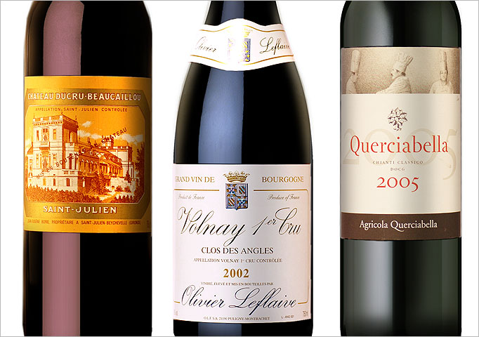
Bordeaux labels are relatively straightforward. In the example on the left, "Chateau Ducru Beaucaillou" is the producer. Beneath, the appellation is stated as "Saint Julien Controlee", a sub region of Bordeaux, indicating that the wine was produced under the AOC regulations of St. Julien. "Mis en bouteille au Chateau" printed over the picture of the Chateau means that the wine was bottled at the Chateau rather than at another estate or by an independent bottler - a guarantee that the producer has taken every duty of care to ensure the final wine is arrives to you in the best possible condition.
Burgundy labels are the most daunting to decipher. In the example pictured in the centre, as with the majority of Burgundy labels, the appellation and vineyard information takes priority. "Volnay 1er Cru" indicates that the wine comes from one of the Premier Cru classified vineyards around the town of Volnay (as opposed to a lesser 'village' vineyard). The appellation is therefore stated as "Volnay 1er Cru Controlee". "Clos des Angles" indicates the location of the specific vineyard site. For those familiar with the district, the name literally suggests the vineyard is situated in an angle between two other vineyards (in this case, Volnay Fremiets and Volnay Clos de la Barre, although this is not stated on the label). Beneath the vintage, the words "Vinifie eleve et mis en Bouteilles par 'Olivier Leflaive', indicate for whom the wine has been produced and bottled, in this case, the owner of the vineyard - Olivier Leflaive - who is actually based in another area of Burgundy, Puligny Montrachet.
With the Italian Wine label pictured right, we first identify the name of the individual producer "Querciabella" and then the appellation or demoninazione "Chianti Classico". The Italian equivalent of the French Appellation Controlee statement is, in this case, DOCG - Italy's highest level. (This statement often appears as a second label wrapped around the bottle neck). Beneath the vintage, the words "Agricola Querciabella" indicate that the estate is not necessarily limited to wine production (it is a farm of types), but that it grows all of its own grapes. In other examples from Chianti, the word Riserva often appears, which denotes that the wine has been aged for at least three years before release.
Of course, none of these labels actually tell us what grape varieties are being used. Competency in this respect is largely a matter of spending time familiarising oneself with what grape varieties are grown where in Europe, and then tasting as many wines as possible.
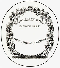 |
| One of Australia's earliest wine labels, printed some time before 1867 and clearly inspired by European 'vine & tendril' bottle ticket designs. |
Early Australian Labels
While many of the world's most famous wine labels were being printed in Europe, the first vineyards in Australia had barely being planted. Early Australian wine label design reflected both the infancy of the local industry as well as its European heritage. They were simple and to the point, as one of the earliest examples illustrates[right], printed some time before 1867 for James and William Macarthur, sons of John Macarthur, the founder of Australia's wool industry. This label for their Camden Park vineyard in New South Wales is decorated with a grape-laden vine (clearly inspired by European 'vine & tendril' bottle ticket designs - see above), though the text is a little more elaborate. Between the words, "Australian wine", "Camden Park" and "James and William Macarthur", space has been reserved for additional information to be added by hand.
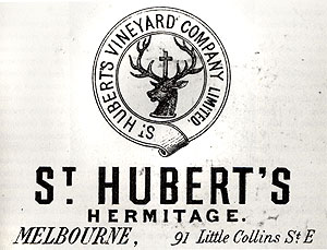
The various wine producing States have notable collections of nineteenth-century Australian wine labels, particularly those in the South Australian and Victorian State Libraries, the former considered to be the best archive in the Southern Hemisphere. Valmai Hankel, one of the South Australian State Library's authorities on Australian wine history notes that the lithographic printer Charles Troedel, who established his business in Melbourne in 1863, produced some particularly elegant labels:
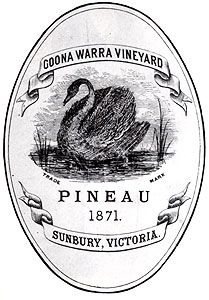
"Much of Troedel's work was, not surprisingly, for Victorian vineyards, such as St Hubert's, Craiglee, C.H. Gehrig, and Goonawarra (featuring a black swan, for 'Pineau 1871') [work for South Australian companies included Penfolds, Thomas Hardy's Bankside and Auldana]. Several labels for All Saints Vineyard proudly proclaim medals won at the Paris Exhibitions of 1873 and 1878 but only tell us that the contents are 'Finest Old Murray Wine'. The most wordy, obviously an antecedent to today's back labels, is for a tokay from John McGee and Co. which pontificates, in white lettering against a claret-coloured background: "This wine having been stored in wood for the full period necessary to ensure maturity - & all unwholesome acids being thereby eliminated - it may be safely included in the dietary scale of the invalid; whilst its fine flavour and delicate bouquet will please the taste of the connoisseur".(5)
 |
 |
| Goonawarra Vineyard. The design has since been re-launched. |
An early label for St. Hubert's Vineyard. |
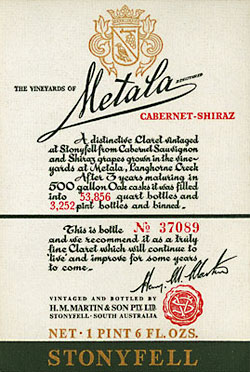
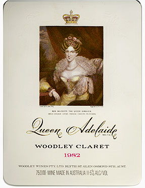
For many Australian wine label enthusiasts, the golden age of wine label design occurred during the 1950's, the focus of which was a portfolio of work by the son of a prominent Adelaide commercial artist. Wytt Morro (b.1922) was responsible for a host of benchmark designs, several of which remain in print today. These include Mildara's Chestnut Teal Sherry, Woodley's Three Roses Sherry and Stonyfell's "Metala" Red Blend - a barely changed, all-text affair reputedly inspired by the French Chateau Mouton-Rothschild label. (It was probably the first Australian label to include an individual number for each bottle). Morro also created some of the most beautiful wine labels ever printed in Australia - the Woodley Treasure Clarets of 1949 to 1956, a series of eight labels, each featuring a rare Australian historical print. Specific compositions appropriate to the character of each vintage were sought, so for example, the portrait of Queen Adelaide for the 1953 vintage was chosen because it reflected the delicacy and refinement of the wine, while a portrait of Captain Cook was selected for the more 'masculine' 1952 vintage. (6) These labels are timeless expressions of understated elegance to which any budding graphic designer would do well to become acquainted with.
 |
 |
| Metala Stonyfell label from the early 1960's. Note the inclusion of individual bottle numbers on the label, an Australian first. |
Woodley's Queen Adelaide. This is a later print based on Morro's design. Nevertheless, it successfully retains the character of the original. |
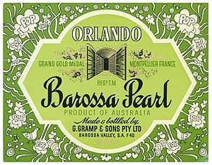
Morro's best known work, though certainly not his finest work, was to be for Orlando's Barossa Pearl Sparkling Wine [pictured below] - a wine of mass-production and mass appeal, now a forgotten Australian legend. Released on November 5, 1956, and marketed to a predominately beer drinking public, many people who had never thought of themselves as wine drinkers, let alone sparkling wine drinkers for that matter, were ready for Barossa Pearl and its subsequent cousin, 'Sparkling Star Wine' (yet another Morro creation). Barossa Pearl first sold in the millions and then in the tens of millions.(7) In fact, Morro remembers that it was impossible to get the labels on quickly enough, so a distinctively shaped ceramic bottle was made with the label being printed on glass and fired.
 |
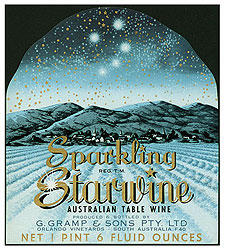 |
| Orlando's Barossa Pearl, launched in 1956. | Sparkling Star Wine. |
Morro's innovations extended in more mundane directions too, like the colour coding of wine labels, which "...involved the same design being used for all varieties but a different colour for each, for example, a red background for port, fawns and browns for sherries through to muscat, or pale greens for white wines".(8) A wrap-around label, which first appeared on Wolf Blass Wines was another innovation, challenging the technology of the day to apply such a wide label without bubbling or creasing the paper. The labeling machines proved inadequate to the task, but "[Wolf] Blass was so impressed with the design that he agreed to have the labels put on by hand" (9).
In a recent interview, Morro summed up his philosophy."[Clients] were very much my friends" he said."I was actually designing for myself, as though I owned the winery, and it had to be successful, and that was it."(10)
| VIDEO: Australian Wine Label Basics. |
Label Classifications and Modern Trends
New technology, less restrictive labeling laws, changing consumer values and a willingness to abandon 'old world' conventions has not only multiplied the creative options available to designers - sometimes leading to 'over-packaging' - but has also demonstrated that people will identify with almost anything. Whereas branding used to revolve around the winery itself, it is now re-focusing its attention towards the consumer, reinventing labels to evoke a feeling, an experience or a preference. The field for creativity has opened so wide, that wine labels are now difficult to classify or categorise. Most fall into or in between the general categories outlined here. (See the slide show below for illustrations from each category).
OLD WORLD / TRADITIONAL DESIGNS
These are labels that have their graphic origins in the 19th century or early 20th centuries. They express reliability, confidence and frequently, a kind of 'old money' aristocratic sophistication with which the consumer can vicariously participate. Common characteristics include sparse but elegant designs, usually on a rectangular die cut, with a neutral or limited colour scheme and a subtle use of gold foiling. Formal script and a coat of arms or etched / engraved image of the vineyard site are also typical. Their market position tends towards the premium to super premium bracket.
ARTIST SERIES
The archetypical label that relies on original works of art are the world famous and highly collectible labels of the Bordeaux First Growth, Chateau Mouton Rothschild. The concept of having each year's label designed by a famous artist of the day was conceived by Baron Philippe de Rothschild himself, and became a prestigious and permanent aspect of the Mouton image with contributions by some of the world's great modern artists: Picasso, Henry Moore, Marc Chagall and Andy Warhol.
Each label is specially commissioned, featuring a full colour reproduction of the artwork with text appearing in an almost incidental fashion. This juxtaposition of a wine against art associates the brand with high culture, and even suggests that it is a work of art in itself. These labels are generally positioned in the super premium category, however, some producers have resorted to using art images to create a sense of prestige when in fact the wine is quite ordinary.
Australia's Leeuwin Estate, based in Margaret River, have successfully imitated the Art Series concept using Australian artists. For those who are interested, the complete collection of Mouton Art Labels is available to view at http://www.theartistlabels.com.
MINIMALIST / ABSTRACT / SEMI ABSTRACT
Leading edge graphic design, by some of Australia's top industrial and graphic designers like Ken Cato and Brian Sadgrove, frequently pushes both printing and application technology to the full. This broad category of labels are often designed on cubist or minimalist plans with innovative graphics, contemporary fonts and/or computer generated art framed by rectangular die cut shapes. Minimal or the complete absence of information on front labels is common providing the bottle with an understated feel, and an image of being up-to-date, independent, even unashamedly idiosyncratic. These wines are primarily aimed at the fashionable Bistro, cafe market and set at premium price points.
ANIMAL LABELS
Perhaps trying to mimic the export success of Australia's Yellow Tail brand (which featured an Aboriginal Kangaroo), 'Critter Labels' as these are referred to in the U.S. accounted for almost 20 percent of the 438 labels launched successfully from 2003-2005 and outsold non critter labels two to one.(11) Apart from familiar and unfamiliar native species, imaginary animals are also to be found. The variety of animals and their various qualities of beauty, grace and energy (or lack thereof) means that they lend themselves to representing the qualities of a wine visually, and forming a range of identifications with the consumer.
PROGRESSIVE DESIGNS
An emerging array of daring, spirited, youthful and witty labels has confirmed that wineries, designers and consumers alike no longer feel constrained by 'Old World' themes. These labels tap into the"Milennials [those in their mid 20's who] are turned off by labels with a picture of a Chateau on them. They think that's their Grandfather's wine,"says Liz Thach, a professor of Wine Marketing at Sonoma State University in the U.S.(12) Instead, the packaging is non intimidating, with a quirky edge that takes the stiffness out of traditional designs. The most successful examples make conversation pieces and seem to correspond remarkably well to the style of wine in the bottle, satisfying the expectations of a younger, increasingly educated market place. Visual characteristics are diverse. Irreverent imagery unrelated to wine, including retro illustrations or photographs, weird animals, cartoons, pop art and dead celebrities, typically combine with irregular die cuts, bright colours, typography not normally associated with the wine industry, and conceptual attempts to match a lifestyle to wine using any of the above devices. These labels seem to resist normal positioning conventions and are sold at all price points.
QUAFFERS
In the past, inexpensive or 'quaffing wines' were generally unpretentious, 100% typeface designs with bright colours and simple die cuts issuing a sense of honesty and reliability. Today the lower end of the market varies widely in presentation, borrowing characteristics from all label categories.
FOLKSY LABELS
These are labels from very small vineyards, usually printed in short runs by local country town presses employing only basic technology. Thin, textureless, semi-gloss paper typically frames a completely type set design; fonts used are commonplace and/or inappropriate. (The font 'Comic sans' for example, hardly anticipates a serious wine). Access to graphic designers is limited, or more likely beyond budget, and so is carried out by the printers or even the wine makers themselves. The cheerful but naïve results reflect the rusticity of the wines and/or the vineyard proprietor but give little or no consideration for market positioning. Yet despite being visually uninspiring, folksy labels can conceal wines of surprising quality and value.
| VIDEO: Wine Label Design. |
What Makes for a successful Wine Label?
Some Contemporary Perspectives.
The wine label designer of today contends with the same basic design elements of the designer of one hundred years ago. Regulatory information regarding producer, vintage, varietal, region and other nominal technical data must be organised using the elements of Paper (stock), Typeface (font) and Colour within a two dimensional shape (die cut). The curved three dimensional surface onto which the label is mounted remains as problematic as before, in its potential to influence the focus, impact or continuity of the design. What has changed for the modern designer is the final context in which their creation is destined, which today means standing out amongst thousands of other labels, each beckoning from a distance and competing for the consumers attention.
It could be said, that the modern designer's challenge is to de-construct the familiar, traditional and required elements of wine labels, and then reassemble those elements in a unique and meaningful way, yet a way that remains intrinsically familiar and appropriate the heart of the wine. To achieve this end, everything that can possibly be done to a piece of paper is done, including eight colour printing, embossing, metal foil stamping, spot varnishing, tearing and custom die cutting(13).
However, wine label designers also need to understand the individuality of the wine maker or vineyard, rather than working in a vacuum of their own imagination. Beyond a shallow design brief, it is substance and feedback that create a great piece of design so that the best labels make reference, however obliquely, to a landmark, an event, a personality or an idea that captures the essence of the subject. Having a foundation in reality, a label can become a narrative or story about the producer and their wine. Beyond enticing the potential buyer to pick up the bottle and engage with it, a great label design will capture forever a small but permanent place in the wine lover's imagination.
Bibliography
1. Ancient Wine: The Search for the Origins of Ancient Wine. By Patrick E. McGovern. Princeton University Press Originally published: 2003.
2. The Origins and Ancient History of Wine. By Patrick E. McGovern, Stuart James Fleming, Solomon H. Katz. Published 1995. Routledge
3. The Book of Wine Antiques. Robin Butler and Gillian Walkling. Antique collector's Club Press, 1995
4. Antique Bin Labels and Bottle Tickets sourced from http://www.butlersantiques.com/uk Visit their site for more examples.
5. From an article in Winestate Magazine. Wine History - By Valmai Hankel, Annual Issue 1998
6. The Australian Wine Browser. Edited by Anders Ousback. The David Ell Press, Sydney 1979
7. The Orlando Way. Tony Baker. Gillingham Printers, Australia, 1987
8. South Australian Library. See http://www.winelit.slsa.sa.gov.au/design_morro.htm
9. Ibid.
10. Interview with Wytt Morro. South Australian Library. See http://www.winelit.slsa.sa.gov.au for more.
11. Sexy Images, Wacky Names, Fine Art Helps Wine Labels Stand Out. Elin McCoy, September 2007. Bloomberg.com
12. Labels Gone Wild, by Paul Franson. Wine Enthusiast Magazine, March 2006.
13. As described by Jeffrey Caldeway & Chuck House from Icon Design, one of America's most influential Wine Label design houses.